Redefining the Job Search Experience for New Immigrants
I led the User Experience Research for the JobRedy website. I successfully planned, ran and executed the research, came up with recommendations based on my user research findings presented to the stakeholders.
Overview
JobRedy is a specialised career coaching organisation with a website designed specifically to connect job seekers with career coaches and mentors to assist them with career advancing their careers. For the JobRedy project, my team was tasked with diving deep into user interactions to uncover pain points and challenges, investigate user needs for efficient task completion, and explore overall website usability while gathering feedback on design features.

Content + Leadership
- JobRedy is a specialized career coaching organization dedicated to connecting job seekers with experienced career coaches and mentors. The platform is designed to assist users in advancing their careers by providing personalized coaching, resume reviews, interview preparation, and career advice.
- JobRedy’s website serves as a central hub where job seekers can find and connect with professional career coaches, offering a variety of resources, including career assessments, job search strategies, and networking tips to help users navigate their career paths effectively. The goal of JobRedy is to make career advancement accessible and achievable for everyone. By leveraging the expertise of seasoned career coaches and mentors, JobRedy aims to empower job seekers with the knowledge and tools they need to succeed in their professional journeys.
- Our team was brought in to conduct UX research for JobRedy’s website. We were tasked with diving deep into user interactions to uncover pain points and challenges faced by job seekers, investigating user needs for efficient task completion, and exploring the overall website usability. Additionally, we gathered feedback on design features to understand how they impact user experience and engagement.
- Through this research, we aimed to identify areas for improvement and provide actionable insights to enhance the website’s usability and effectiveness, ensuring that JobRedy continues to support and empower job seekers in achieving their career goals.
Research Goal, Assumption + Research Questions
Research Goal
- By conducting this research, our team aimed to enhance the JobRedy career coaching platform by gathering feedback from experienced users and conducting competitive analysis with other similar platforms. Our goal was to identify key user pain points and opportunities for improvement, ultimately increasing user satisfaction and engagement. Additionally, we aimed to attract new users to JobRedy, support seamless career advancement, and boost customer retention and loyalty. By delivering actionable insights, we sought to create an intuitive, powerful hub that sets a new standard in career coaching and development.
Assumption
The assumptions made about a career coaching platform like JobRedy are that it is secure, reliable, and provides real-time updates on career opportunities and resources.
- It should also be user-friendly and intuitive for users to navigate and interact with.
- Additionally, JobRedy should offer accurate information about job search strategies, career assessments, networking tips, and other resources related to career advancement
It is also expected that when a job seeker land on the JobRedy website they will be able to identify the various services JobRedy offers and possibly sign up with a career coach.
Research Questions
- How do users perceive and identify with the service?
- What information do they find most valuable when seeking career coaching services?
- What are their key pain points regarding using any part of the service?
- What are the usability issues with the existing JobRedy website?
- How do users navigate the website? Are there any issues with this?
- What is the users’ perception of the system design?
- What enables a user to make a decision to use the system/make a booking?
Methods, Tools & Ownership
Research Owned
Phase 1 – Home Page
- Research Artefacts Documentation – to document and plan the research – refer to it as a guide for the team, recruit selected participants based on agreed user groups
- 1 on 1 Interviews with moderated usability testing with JobRedy users – To answer more difficult questions on how they approach their job search while using the discussion guide to gain more insight into the needs and pain points of users.
- Affinity Sorting & User Persona -Journey mapping – to analyze what users can identify the steps they need to take to complete a task, identify any potential issues or roadblocks, and gain insight into how their experience could be improved.
Research Used
Microsoft power point and Microsoft word for collaboration, Zoom for moderated usability testing, Mural for analysis and synthesis of data and MS powerpoint for presentation.
Research Artefacts & Learning
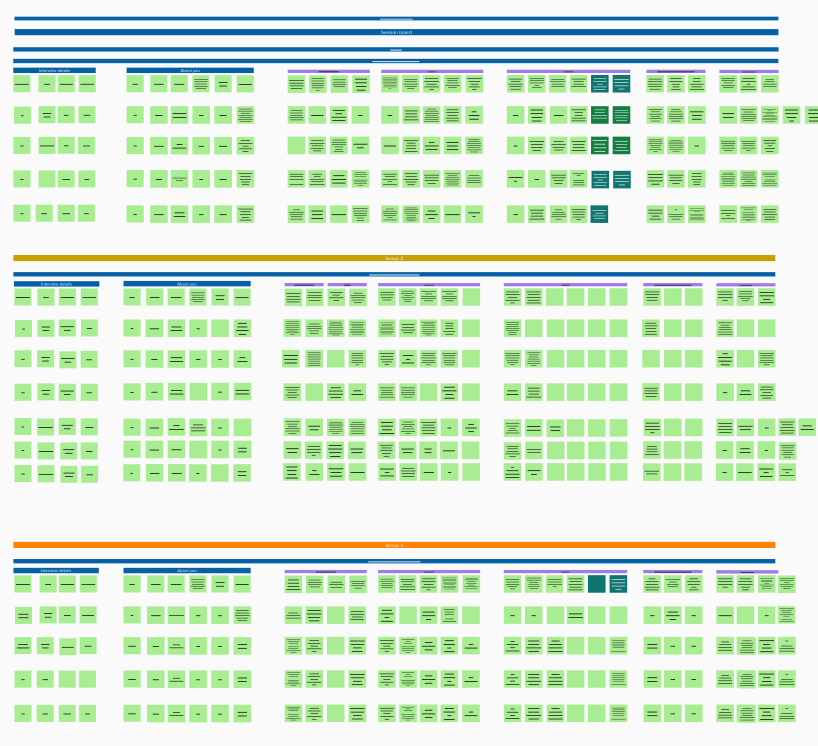
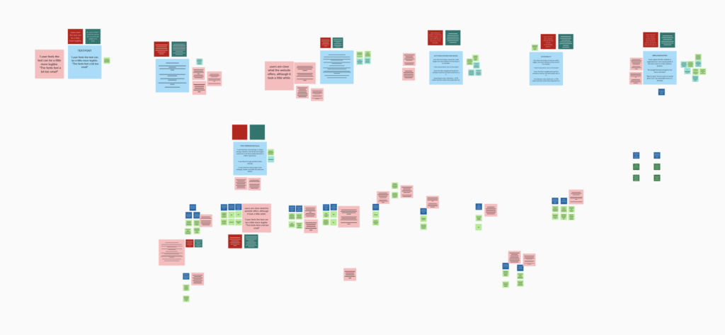
Affinity Sorting
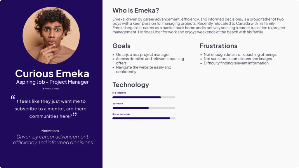
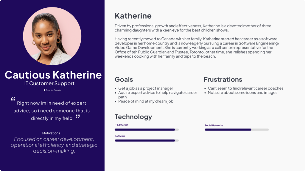
Personas
What we did
Affinity sorting was carried out by I and other team members for data analysis and synthesis based on the data gathered from the 1 on 1 moderated usability testing. This included testing the various aspects of JobRedy website which are the home page, profile and booking page. The Interview was carried out with focus on these particular features of the website – Initial impression, layout, navigation, contents and Graphic & icons.
Conducted 4 rounds of usability testing with 12 users
- Interviews
- Usability Testing
- Analysis & Synthesis
- Created Personas
Usability Testing - Home Page
- What are your initial thought about the layout of the home page
- How clear is the information on the home page?
- What re your expectations?
- How easy are you able to move around the page
- Were you able to find relevant information?
- Is the content on the home page organised to you?
Usability Testing - Profile Page
- What aspect of the profile page stood out to you immediately?
- How easy/straightforward do you think it would be to fill out the bio page?
- What information did you feel would have been necessary to help you make a decision?
- Did any feature of the page encourage you to explore further? (if yes, which)
- Did any feature of the page discourage you to explore further? (if yes, which)
- Do he buttons and graphics work the way you expect them to?
Usability Testing - Bookings Page
- Overall, what are your thoughts about the information presented on this booking page?
- Are any aspects of the navigation confusing?
- Overall what was the booking journey like for you?
- Where all the buttons and icons easy to find and use?
What We Learned
Home Page
- Users actively seeking career progression are steadily on websites like indeed.com and ladders.com so they benchmarked most of the features of the website with the JobRedy website
- Users found the website a bit tough to navigate because the menu options did not “expand” to give more information and features.
- Users would be much happier if the buttons were bigger and much more interactiove so they could know where exactly they were and what to expect on the website.
- Experienced job seekers who were seeking a career transition did not find enough information about the services offered and the coaches to influence a decision to make them book a session.
- The overall text legibility proved difficult for some readers to read thus increasing the cognitive load.
- Some users found features on the website to be non functional, leading most users to find it frustrating and feel stuck
Profile Page
- Users considered the profile page as valuable as it had information about the coaches, yet they felt it lacked sufficient details. They expressed a preference for additional features such as reviews and Frequently asked questions (FAQ)
- The main pain point was that the further engagement of the website was behind a login wall. Most users did not feel confident to sign up to the website.
- While certain aspects of the profile page were confusing for some users, others desired deeper exploration of the content. However, the consensus was that users found the buttons easy to navigate.
- The usability testing revealed numerous non-functional features on the website. However, found the navigation on the website is well-organised, making it easy to navigate.
User Stories
- “As someone seeking career changes and progression, knowing exactly where to go from the menu without confusion is crucial. Detailed submenus or descriptions under each main item would save time and make it easier to book sessions with career mentors, enhancing the overall efficiency and user experience”
- “I felt uncertain when interacting with the buttons. It was hard to tell if they were clickable. I think the buttons should be larger and easy to understand. This would help me feel confident I’m in the right place.”
- “I need assurance that I am in the right place. It’s hard to find relevant information that meets my career goals. I also feel I need more information on the coaches to make a decision. More clarity on what to expect from the coaching feature would really help”
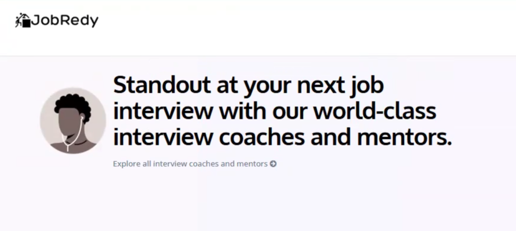
- User not sure what the avatar was communicating
- User expected to see the menu right beside the logo
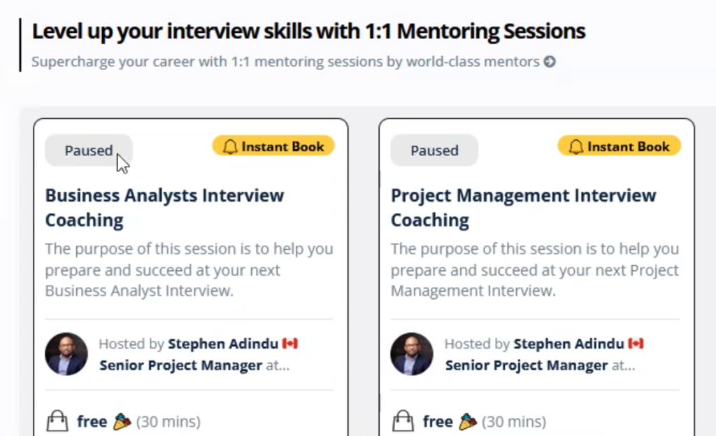
“Not sure what these boxes are communicating and waht does paused mean?”

“This feels likea website for support”
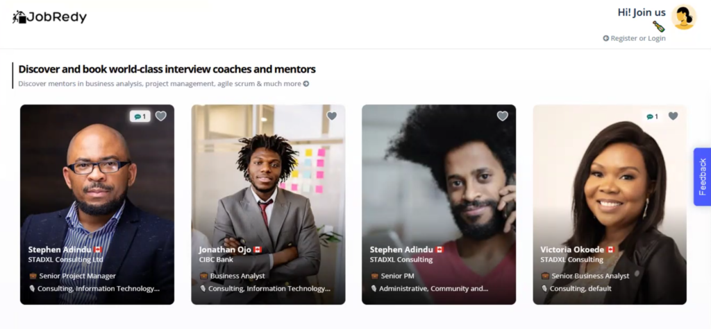
“I cant see anybody that would be of help to me because they all seem like business people. Right now im in need of help, so i need someone that is directly in my field“

“I had a hard time reading this texts here”
What Worked Well
In the end, we learned that
- The platform demonstrated a deep understanding of the local job marketand expertise in Toronto, appealing to local job seekers and ensuring that the services were relevant and impactful.
- Platform connects job seekers with experienced coaches, offering personalized coaching and career advice. Services like career assessments, job search strategies, and networking tips aid in career navigation.
- Usability testing revealed organized navigation, making it easy to find and engage with content.
Recommendations
- Implement expandable menu options for easier location of specific services and features.
- Redesign buttons with increased size and clear visual cues for better interactivity.
- Provide detailed service information, including reviews and FAQs, for informed decision-making.
- Enhance text legibility with larger font size and higher contrast for better accessibility.
Reflections
- During the initial stages of our UX research for JobRedy, we faced several challenges related to user navigation and interactivity. Users found the website navigation tough due to the lack of expandable menu options, making it difficult to locate specific services. Similarly, the button design lacked clear visual cues, leading to uncertainty about their interactivity. Addressing these issues was crucial to enhance user confidence and ease of navigation.
- If I were to restart this project, I would place a stronger emphasis on detailed information and visual accessibility from the beginning. Users seeking career transitions found the information about services and coaches insufficient, and the text legibility was difficult for some readers, increasing cognitive load. By focusing on providing comprehensive details and improving text legibility early on, we could have alleviated these user frustrations more effectively.
- Throughout the project, the value of local expertise and relevance became evident. JobRedy’s focus on the Toronto job market resonated well with users, making the services more relevant and impactful. This local focus helped position JobRedy as a valuable resource for job seekers in the area, enhancing its appeal and effectiveness. Ensuring that our platform catered specifically to the local job market was a key factor in its success.
- In terms of working style, I learned the importance of staying organized and using collaborative tools. Tools such as Notion and Zoom were invaluable for keeping track of research materials and data. Effective communication and collaboration with team members and stakeholders were crucial for the project’s success. This approach not only facilitated smoother project management but also ensured that we could adapt quickly to user feedback and make necessary adjustments promptly.
The JobRedy project taught me the importance of a user-centered design approach, local expertise, and effective communication. By addressing user pain points and continuously improving based on user feedback, we created a platform that truly supports and empowers job seekers in their career advancement journeys.
“The JobRedy project taught me the importance of a user-centered design approach, local expertise, and effective communication. By addressing user pain points and continuously improving based on user feedback, we created a platform that truly supports and empowers job seekers in their career advancement journeys”